CSS
常用函数
- var | attr | url
- rgb | rgba | hsl | hsla
- calc | min | max | clamp
- translate | rotate | scale | skew
- linear-gradient | radial-gradient | conic-gradient
- blur | brightness | drop-shadow | grayscale | invert | opacity
- cubic-bezier
样式优先级
!important > 行内 > 内部 > 外部 > id > 类 | 伪类 | 属性 > 标签 | 伪元素 > 通配符 > 继承 > 浏览器默认
重排 & 重绘
- 重排:元素的位置发生变动时发生重排,也叫回流。
- 重绘:元素的样式发生变动,但是位置没有改变。
zoom & scale
zoom- 缩放时改变元素占据的空间大小
- 缩放位置相对于左上角缩放
- 对文字等比缩放,最小缩放到 12px
- 会引起整个页面重新渲染
scale- 缩放时不改变元素占据的空间大小
- 缩放位置默认相对于中心缩放
- 对文字等比缩放,无限制
- 会在当前元素上重绘
nth-child & nth-of-type
nth-child
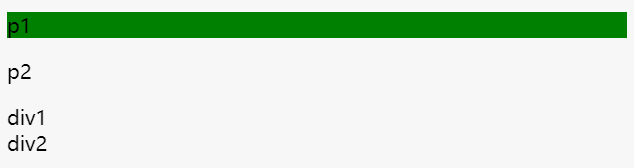
:nth-child(n) 选择器匹配父元素的第 N 个子元素,不论元素的类型。
<div>
  <p class="green">p1</p>
  <p class="green">p2</p>
  <div class="green">div1</div>
  <div class="green">div2</div>
</div>

div p:nth-child(1) {
  background-color: green;
}
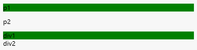
<div>
  <p class="green">p1</p>
  <p class="green">p2</p>
  <div class="green">div1</div>
  <div class="green">div2</div>
</div>

div div:nth-child(1) {
  background-color: green;
}
nth-of-type
:nth-of-type(n) 选择器匹配父元素特定类型的第 N 个子元素,且和标签类型有关,可能会匹配到多组。
<div>
  <p class="green">p1</p>
  <p class="green">p2</p>
  <div class="green">div1</div>
  <div class="green">div2</div>
</div>

div .green:nth-of-type(1) {
  background-color: green;
}
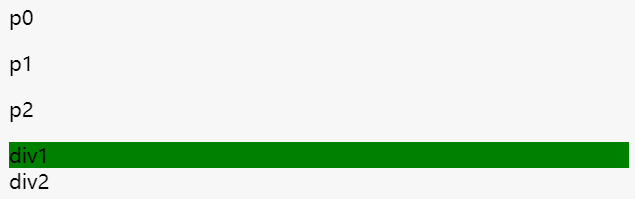
<div>
  <p>p0</p>
  <p class="green">p1</p>
  <p class="green">p2</p>
  <div class="green">div1</div>
  <div class="green">div2</div>
</div>

div .green:nth-of-type(1) {
  background-color: green;
}
nth-of-type 详解
:first-of-type 的误用nth-of-type 与 nth-child 的区别
flex-basis 和 width 优先级
max-width/min-width > flex-basis > width
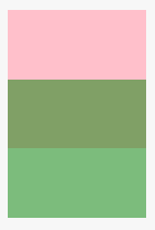
margin 负值
<div class="a"></div>
<div class="b"></div>

.a {
  width: 100px;
  height: 100px;
  background-color: pink;
  margin-bottom: -50px;
}

.b {
  width: 100px;
  height: 100px;
  background-color: green;
  opacity: 0.5;

  // margin-top: -50px;
}
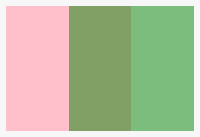
<div class="a"></div>
<div class="b"></div>

.a {
  width: 100px;
  height: 100px;
  background-color: pink;
  float: left;

  margin-right: -50px;
}

.b {
  width: 100px;
  height: 100px;
  background-color: green;
  opacity: 0.5;
  float: left;

  // margin-left: -50px;
}
文本溢出隐藏
单行文本
.textflow {
  overflow: hidden;
  white-space: nowrap; // 文本不换行
  text-overflow: ellipsis; // 文本超出呈现省略号
}
多行文本
.textflow {
  overflow: hidden;
  display: -webkit-box; // 盒模型
  -webkit-line-clamp: 4; // 控制文本行数
  -webkit-box-orient: vertical; // 垂直布置子元素

  text-overflow: ellipsis; // 不确定是否需要加上,不加好像也能显示省略号
  word-break: break-all; // 避免行末是英文或数字带来的问题
}

PS: 该方法不兼容 IE
隐藏元素
- display: none
不占位置 - visibility: hidden
占位置 - opacity: 0
占位置 - transform: scale(0)
占位置 - clip/clip-path
占位置 - H5 hidden 属性
不占位置 - position: absolute
绝对定位移出可视区域 - z-index 负值
其他元素覆盖住该元素